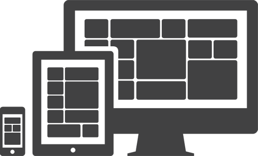
I was recently in a meeting where someone said they were now going to “design for mobile first and then simply expand to larger screens“. This is one of those things that sounds smart but the more you think about it, it’s really foolish. This leads one to believe that the only difference between mobile devices and tablets/PCs is screen size, when in fact they are very different devices. Here are some of the reasons.
Usability – Click & scroll = web on a PC vs. tap & swipe = web/apps on a tablet/smartphone. Those are big differences! Apps make it easy to see the difference but let’s look at a site to illustrate the differences. Let’s take a look at Jetsetter.com. This site has an elegant layout. You can imagine just about any type of content fitting into this design. Now, let’s break it out by device:
- PC – This site is good as is except that there should be endless scroll like Twitter.com. Careful with endless scroll. Make sure the response of the site doesn’t slow down. Rule number one for usability is response time must scream!
- Tablet – The home page is easy to see staying the same but once you click into a listing, it would be best if users could swipe to the left or right to get another listing, especially if it’s a search result. Swiping through properties should be on an endless loop with a note that lets you know you’ve viewed this property before. Don’t ever let them come to a dead end.
- Smartphone – This should be one big swipe-fest! Swipe up/down to see a listing of properties. When you tap into one to get more detail, you can then swipe left/right to get to the details pages of other properties or go back to the home page by double tapping.
Consumer behavior – People use these devices differently and therefore need to be a more contextual. Again by device:
- PC – These devices are used primarily at work. Information gathering is the focus. What’s available, reviews, etc.
- Tablet – These devices are used primarily 6am-8am and 8pm – 10pm. Where are most people at that time of day? They’re in bed or on the couch. They’re reclining and relaxed. The content that’s displayed should focus on highlighting the experience of staying at the locations. Video reviews. 3D rendering of the interior. Show the views from each location. Anything that helps put them in that room.
- Smartphone – These devices are used all the time. On the way to work. During work. At dinner. The strength of these devices are that they quickly help you find things. Room availability. Cost. Booking the room. Much more action driven.
These are general guidelines and as a business you need to spend some time looking at your data. Once you do that you’ll usually see some definitive trends and from there you can make better design decisions. Also, remember to A/B test as much as you can. Yet another reason to stay agile and flat!