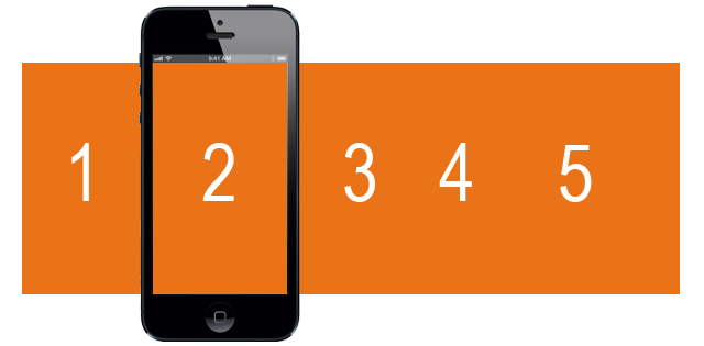
 So I’m working with students on creating mobile applications and I’ve seeing some amazing business ideas. Apps are best when they’re simple tools that allow customers to execute on behalf of the company. I have a team that has come up with a great idea – which I can’t share – and it only has five screens. I have them mockup their app using Axure and I started by showing them how to create simple navigation using 5 buttons. After looking at the app for a while, we started to talk about the differences between apps and mobile sites. Native vs. Web-based for those taking notes. Some of the differences are:
- links vs. buttons
- click vs. tap
- swipe vs. scroll
I then asked (myself and) them, ” Do we need to have buttons at all?” After giving me a look that said, “I dare you to say something crazier.” I drew it up on the whiteboard and reminded them that usability is marketing. What could be more simple than five screens that you can swipe to. (One of the key elements to usability is learnability.) I told them a customer would use the app twice and then quickly figure out how to get the screen they needed. I love this idea and actually I’m trying to come up with an excuse just to code it.
If anyone know of an app that is this dead simple, when it comes to navigation, please let me know.